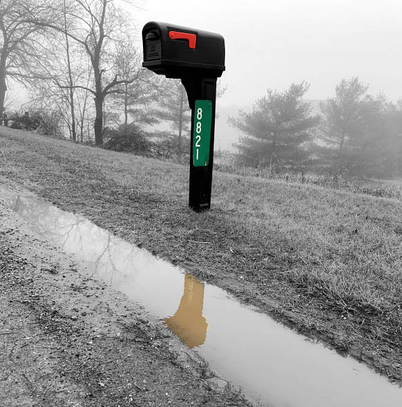
Life threw the mail
I chose a mail box because it was a simple object that could stand out in a simple way because of the contrast and how dark the mail box is. Also the colors on the mail box is bold as well as the reflection. I chose to make the background low contrast that way it doesn't distract you from the focal point. |
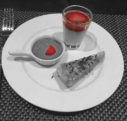
Fruitful
I chose to bring out the red in the desserts because of the bold colors and honestly the big pop of color. The color stands out and bring your eyes straight toward the color. I really like how this image turned out, originally i thought the red looked fake but, since theres no other colors, it just looks off. |
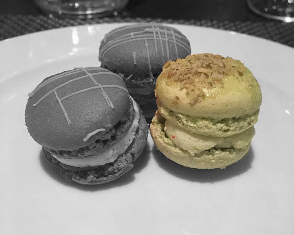
Pale
This picture of three macrons are simple but I chose to highlight the pale green one because it showed the most texture and it was more interesting than the other colors. The green is a simple color, but theirs a lot of contrast so I think it balances out. The plate shows the shadow of each macron which also shows of depth and light. |
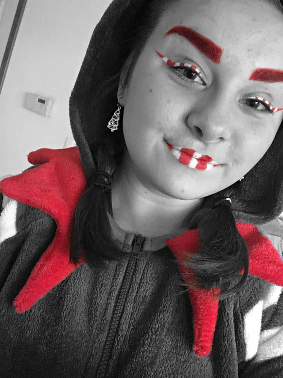
Christmas Elf
This was a costume from halloween when I dressed up as a Christmas Elf. I chose to only show the reds because of the bold color and it really brings out focal points. I decided to not show the green because the color was a little dull and nots interesting. |
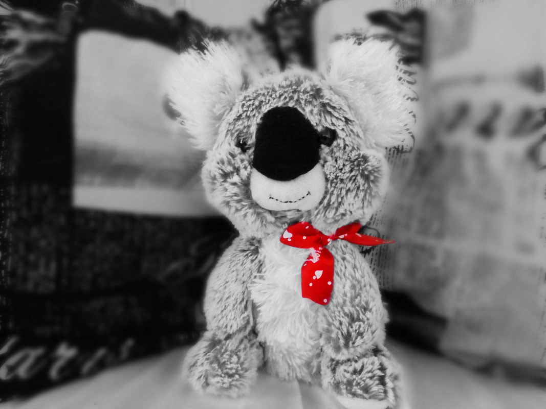
Bow
Just like the other photos I brought out the red. Although, it was the only color I could bring out since everything else was black and white. The red is eye catching and pretty. The bow has white on it so theres patches of white mixed in. |
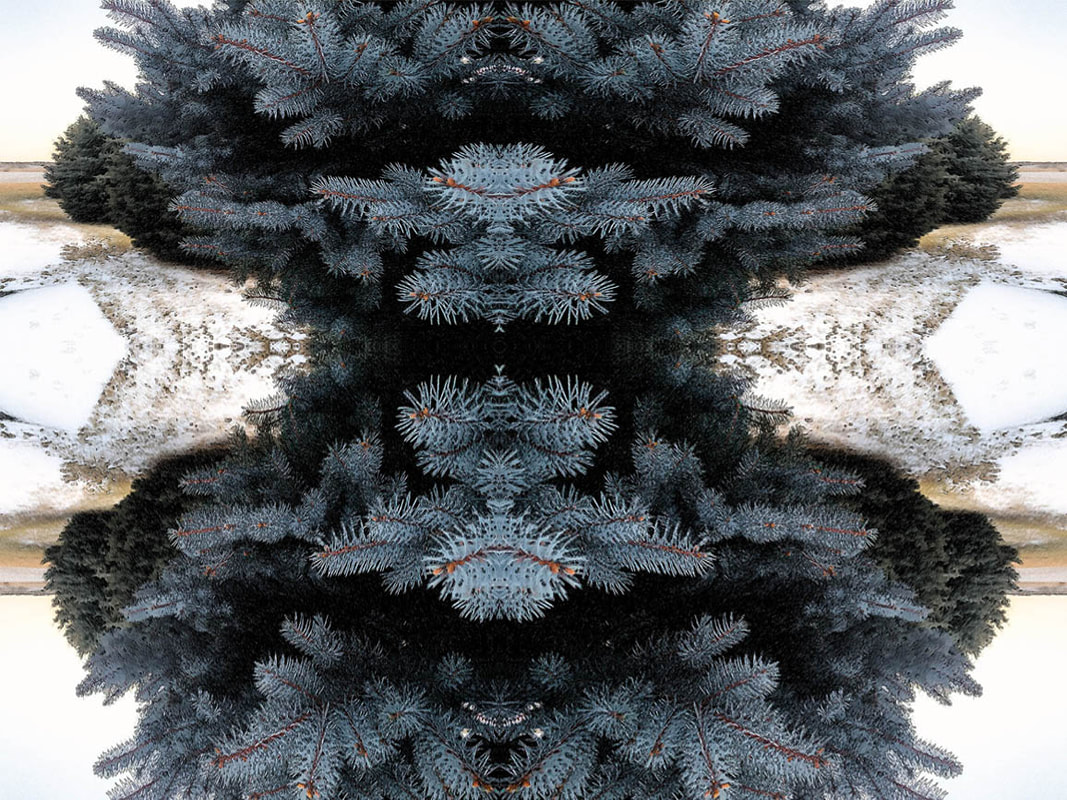
Rounded
|
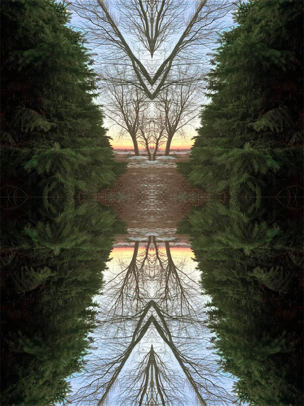
Diffused Sunset
|
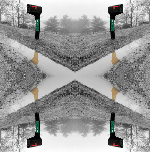
four addresses
|
Yellow Spot
|
Hourglass
|
